Auto
What Changed and Why It Matters: Inside Bentley’s Emblem Evolution
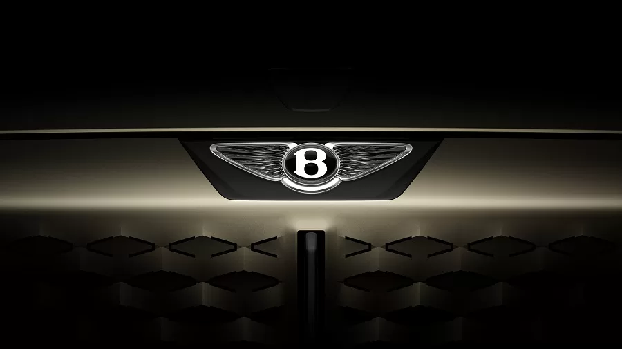
- In the latest emblem treatment, Bentley Motors reflected modern formats and new market needs while privileging the vintage feel.
- This quieter re-optimisation might throw additional light on the interplay among heritage branding, visual adaptability, and identity stewardship.
Bentley Motors, a hallmark of British automotive craftsmanship, began its journey in 1919. The brand has set itself as a name synonymous with power, prestige, and precision engineering. At some time in its lifetime, Bentley, based in Crewe, England, was acquired by Volkswagen Group; this year, 13,560 cars have been sold globally, down from an 11% decrease compared to the record set in 2022.
Among the highest-selling models are the Bentayga and Continental GT; in 2023, the Bentayga took up 44% of sales, whilst Continental GT and GTC formed 31% of sales.
Recently, the brand has introduced a revised version of the classic winged “B”. It was not a relaunch, nor an outright pivot; rather, it was a restrained, deliberate update designed to meet the needs of today’s digital interfaces.
Bentley’s Design Heritage
The original Bentley logo, designed in 1919, has undergone only minor revisions over the years. The winged “B” has always been about speed and performance. It harkens back to Bentley’s glorious racing heritage, including victories in Le Mans from 1924 to 1930, with a return in 2003 by Speed 8.
Previous versions of the logo were much more florid, with heavier usage of gradients and dimensional effects. These would have been logical for badges that adorn the bonnet or printed material, but would simply collapse or blur in digital environments.
The update thus suggests the continuation of the heritage but also reflects an understanding of usability systems in today’s world. It is a fine balancing act: respecting historical styling while eliminating visual clutter.
The Shape of Change
For a casual viewer, one could say Mr. Bentley’s logo is untouched. The winged emblem crowning the grille remains there for a reason. The central “B” still retains British identity. But some small refinements tell a contrasting story.
The updated logo features changes of:
- Flatter forms with simpler shadows
- Reduced visual noise
- More symmetrical wing lines
- Better scalability for screens
- Better legibility across formats
Visual adjustments to satisfy functional needs. The entire redesign process was geared toward adaptability across media and not merely for aesthetics. The redesign process focused on adaptability across media, not simply on aesthetics.
Design, Not Decoration
The updated emblem supports Bentley’s growing digital ecosystem. In addition to physical branding, the logo now appears in digital dashboards, on mobile apps, and within connected platforms.
The pursuit of consistency of branding across a gamut of display types, OLED to AR, was enough for the design firm to rethink scale and detail. Logos that used to be on the bonnet are now present on the corners of smartphones and watches.
Respecting Heritage
While refined, the updated logo retains familiar elements:
- The central “B” remains consistent with prior renditions.
- Wing outlines have been reshaped for geometric clarity.
Contrary to previous versions, some feathering beneath the wings has been removed entirely to enhance clarity. While these decisions were intentional, some level of compromise was made to keep them readable.
Bentley’s heritage remains one of the pillars. More than 70% of all Bentleys ever made are still in operation-a testament to the long life of these cars and the collectors’ loyalty toward the mark.
A Case for Optical Refinement
Refinements include:
- Removal of shadow gradients to support monochrome applications
- Adjusted wing curvature and line symmetry
- Optimised negative space in the “B” for smaller formats
These changes improve the logo’s adaptability without compromising brand recognition. The goal was to make the redesign feel invisible in daily use but essential in function.
Behind the Scenes: The Process
Bentley confirmed the redesign was developed internally under the direction of Robin Page, the Director of Design. The visual concept was shaped by Young Nam.
The team used 3D mockups to test the emblem on future electric vehicle platforms. These tests included how the logo appears on digital clusters, etched materials, and screen animations. Surfaces tested ranged from matte finishes to high-resolution infotainment panels.
Where the Logo Lives
The logo is now featured across multiple interfaces:
- Vehicle infotainment systems
- Digital keys and mobile control apps
- Charging interfaces on hybrid and EV models
- Product configurators on web platforms
- Social media and video branding assets
Each placement demanded a design that could be both iconic and functional.
From Studio to Showroom
Bentley’s update involved collaboration between its design and engineering departments. The team ensured consistency in typography, weight, and spacing across both print and digital formats.
Digital displays were optimised with proportional animation frames, avoiding distortion or misalignment. This harmonisation results in a fluid brand presence, from physical vehicle interiors to mobile user interfaces.
A Designer’s Reflection
There’s a quiet complexity in design decisions that prioritise fidelity over flair. Many of Bentley’s updates could go unnoticed by the casual viewer. But the impact lies in how naturally the new logo integrates across all touchpoints.
While most will not see the underlying vector edits or spacing calculations, they will experience a brand identity that is cleaner, sharper, and more in tune with where it lives today.
Looking Ahead
Bentley originally targeted full electrification by 2030 under its Beyond100 plan. This target has now shifted to 2035, aligning with broader market and infrastructure realities.
The redesigned logo anticipates these transitions. It is built to live across future platforms—digital, electric, and potentially autonomous.
It also positions the brand for forthcoming sub-identities and digital features that may emerge as Bentley’s vehicle and service ecosystems evolve.


